Whether you’re promoting a gig, launching a product, or building awareness for your brand, a well-designed poster can make all the difference between being seen or ignored. But designing for the street isn’t like creating something for Instagram or print. You’ve got seconds to grab attention, deliver your message, and make it stick.
At Rock Posters, we’ve helped everyone from independent artists to major brands get noticed through powerful street poster and outdoor advertising campaigns across Australia. If you’re wondering where to start, this guide breaks down the essential elements of good poster design and how to make your message shine in the wild.
First, start with the “Why”
Every great poster starts with intent. What are you trying to say, and more importantly, why should anyone care?
Maybe you’re launching a new product. Maybe you’ve got a gig coming up next weekend. Or maybe you just want the world to know your brand exists. Whatever the goal, your design should revolve around that single purpose.
Too often, we see posters that try to cram everything in: logos, sponsors, 10 lines of text, a paragraph about the event, and maybe a photo for good measure. The result? No one reads any of it.
Before you even open your design file, ask:
- What’s the main takeaway I want someone to walk away with?
- Where will this be seen?
- Who am I speaking to?
Core Principles of Poster Design
Visual Hierarchy
When someone sees your poster on a wall, they’ll glance at it for maybe three seconds. That’s your window.
Good design leads the eye, telling the viewer what to read and in what order without needing them to think about it.
Your main message, usually a bold headline or event name, should hit first. Then, the essential details: dates, locations, times, maybe a URL or QR code. Finally, any secondary info like sponsors or social handles can fade into the background.
You don’t have to make everything the same size or weight. In fact, you shouldn’t. Think of your layout like a mini billboard: the bigger and bolder the message, the louder it speaks.
Typography
Type is your voice. It’s how your poster speaks—literally.
When choosing fonts, readability trumps personality. That doesn’t mean it has to be boring, but if someone can’t read your text at a glance from across the street, the message is lost.
Tips that always hold true:
- Use sans-serif fonts for high legibility.
- Avoid long blocks of text—stick to short, punchy phrases.
- Play with scale and spacing to add visual interest, not clutter.
And one last thing: resist the temptation to use five different fonts. One or two is more than enough.
Images and Graphics
You don’t need five images to make an impact. One strong visual can carry your entire poster.
Whether it’s a photograph, a graphic, or custom illustration, your visual should evoke a feeling. Is your gig going to be raw and underground? Your image should reflect that. Is your product sleek and high-end? Then clean lines and minimalism might be your friend.
Try not to rely on generic stock imagery unless it genuinely suits your brand. Authenticity comes through in design, and nothing screams “cookie-cutter” louder than an awkward Shutterstock photo.
A great trick: squint at your poster from a few steps back. If the image holds your attention and doesn’t compete with your text, you’re on the right track.
The Power of Colour
Colour is one of the first things we notice. It sets the tone instantly, conveys emotion, and affects how readable your poster is in different environments.
Want to demand attention? High contrast is your friend. Think bright yellow on black, or white on deep red. Just be mindful of the context—what might stand out in a dark alley could disappear in daylight.
Also consider:
- Cohesiveness with your brand (don’t mix neon punk with polished luxury… unless that’s the vibe).
- Environmental harmony (will your poster blend in with the surroundings or stand out?)
Less Is (Almost Always) More
The best posters are bold and minimal. They say just enough to create curiosity, give direction, or spark action and then let the design breathe.
You don’t need to explain everything. A killer image, a powerful headline, and a single line telling people where to go or what to do is often enough.
If you’ve got too much copy and not enough space, it’s a sign to trim. Edit ruthlessly. Let your visuals do the heavy lifting.
Placement Matters Just As Much As Design
You can have the most eye-catching poster in the world, but if it’s in the wrong place, it won’t get noticed.
Street posters don’t have the luxury of scrolling or re-targeting. Their impact depends entirely on where they’re placed and who sees them. Different locations serve different campaign goals, and understanding the context of each space is key to success.
- Nightlife Districts
- Ideal for entertainment-focused posters such as live gigs, club events, and festivals. These areas draw a younger, social crowd, and visibility here means you’re part of the cultural conversation.
- University Zones
- A go-to for youth brands, student offers, and product launches aimed at Gen Z. Posters placed near campuses, food precincts, or transit hubs catch the attention of students on the move.
- High-Footfall Metro Areas
- Think train stations, CBDs, and busy intersections. These are prime locations for broad-reach awareness campaigns targeting commuters, professionals, and city-goers.
- Billboard-Size Mega Sites
- Perfect for making a bold statement. These high-impact placements work well for major brand activations, national product launches, or campaigns that need serious scale and visibility.
- Local Precincts & Community Hubs
- Ideal for grassroots campaigns or events tied to specific areas. These spaces bring authenticity and trust, especially when targeting niche or local audiences.
Each location type offers a different kind of exposure, so choosing the right mix is essential. A well-designed poster won’t work its magic unless it’s put in front of the right people, in the right setting, at the right time.
When working with a poster printer and distributor, like Rock Posters, discuss placement strategy and options available to target your audience in the most effective way.
Examples of Great Poster Design
Charli XCX – BRAT Campaign (Australia, 2024)
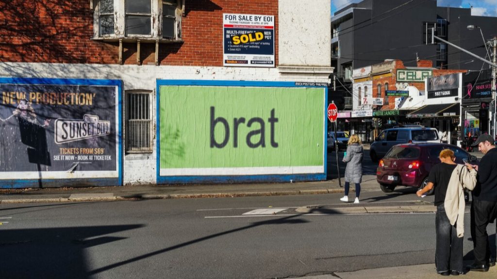
In the lead-up to the release of her album BRAT, Charli XCX launched a bold and disruptive poster campaign across major Australian cities—including Melbourne, Sydney, and Brisbane. The posters were stark, text-heavy, and intentionally lo-fi, using the iconic bright neon green background with the word BRAT in an aggressively simple typeface.
No imagery. No logos. No extra copy. Just one word.
The result? Massive impact on social media. The design stood out precisely because it didn’t follow the usual rules of polish and promotion and engaged Gen Z populations all across Australia. It created intrigue, sparked viral discussion on social media, and aligned perfectly with the anti-pop, underground aesthetic of the album itself.
Barack Obama – Hope Poster (USA, 2008)
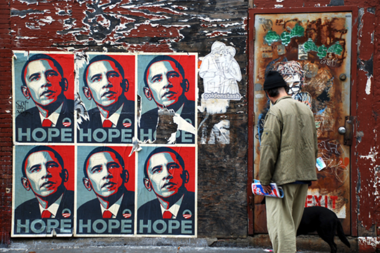
Another timeless example is the iconic HOPE poster designed by Shepard Fairey for Barack Obama’s 2008 presidential campaign. This poster blended graphic design, political messaging, and street art aesthetics in a way that broke new ground.
With its stylised red, white, and blue portrait and a single word beneath—HOPE—it captured a movement and humanised a political figure. It was easy to spot from a distance, emotionally resonant up close, and quickly spread from walls and streets into the global cultural landscape.
While this design was more complex than Charli XCX’s minimalist approach, it still followed the core principles: a strong focal point, simplicity, emotional clarity, and purpose-led design.
Calvin Klein – My Calvins Campaign (Global, 2014–2016)
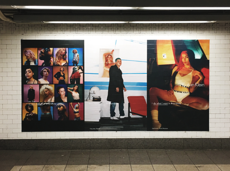
The #MyCalvins campaign by Calvin Klein blurred the line between fashion advertising and cultural moment. While the campaign spanned billboards, social media, and video, the poster executions played a crucial role in building the brand’s street-level presence—especially in urban centres like New York, London, and Sydney.
Featuring black-and-white imagery of celebrities and models like Justin Bieber, Kendall Jenner, and FKA Twigs, the posters paired striking minimalist photography with the now-famous tagline “I ___ in #MyCalvins.” The design was clean and direct: a powerful image, a bold line of copy, and the product, Calvin Klein underwear, featured front and centre.
What made this campaign stand out:
- It used high-contrast visuals and strong photography to dominate public space.
- The user-generated hashtag extended the poster’s life online.
- Its street placement targeted style-conscious youth in trend-heavy locations—exactly where the brand’s core audience lived and socialised.
It was aspirational, personal, and highly shareable—and it showed how poster design can help create a lifestyle movement, not just an ad.
Do I DIY or Work With a Designer?
If you’ve got design experience, you may be able to pull something together in Canva or Adobe Illustrator, but it does take a practiced eye to understand how your design will perform in real-world conditions.
Many businesses investing in street posters or outdoor advertising will typically choose to work with a professional graphic designer or creative team to make sure the poster design is bold, clear, and built for the street.
It may be worth speaking to your poster printer and distributor before engaging a designer as well to better understand the size and specs of your campaign first.
Start Your Next Campaign
Great poster design isn’t just about looking good; it’s about being seen, remembered, and acted on. From your choice of colours and typography to the way you lay out your message and where it ends up on the street, every detail matters.
By starting with a clear purpose, designing with real-world environments in mind, and choosing placements that align with your audience, your poster can do more than just decorate a wall—it can spark interest, drive engagement, and amplify your brand.
Whether you’re launching your first poster campaign or levelling up your next one, Rock Posters is here to help. From strategy and design advice to high-quality printing and street-level distribution across Australia, we make your message impossible to ignore. Get in touch with Rock Posters today for a free quote.
Author: Paul D. Frehley
Rock Writer (Paul D. Frehley) is the editorial voice of Rock Posters, Australia’s independent out-of-home media network with printing facilities in Sydney and Melbourne. Since 1986, we’ve helped brands, events, and cultural institutions — including the National Gallery of Victoria, the Sydney Film Festival, and the Australian Museum — show up where their audiences already are. We cover campaign strategy, creative execution, and the thinking behind effective street-level and large-format advertising. As an award-winning sustainability leader, we’re also committed to making outdoor advertising better for the communities and environments where we work.