How To Design An Unmissable Street Poster
Emma Robbins
Executive Creative Director

Your biggest creative hint is in the name.
The design must rock!
As a medium that traditionally promoted rock bands, this is no place for brands to masquerade as cool. The words must rock. The whole thing must rock people’s worlds, and in a very short space of time. If you’ve got a sliced cheese client or a 99% fat-free yogurt wanting to be in this space, think of them as a band. A coke-sniffing, stage-diving, heavily tatted cheese. That’ll get you into the right zone.
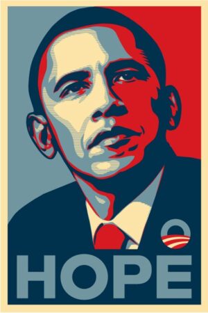
The best example for me of this is the Obama Hope poster. Could have been a ScoMo ho-hum style “Jobs and Growth” style headline with an image of a battling worker smiling at the camera with some big FedGov logos and website link, but no. Shepard Fairey looked at Barack as a rockstar and said one thing. And the rest is history.
You have one chance to rock.
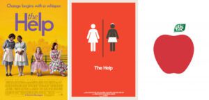
Like any out of home, keep the words minimal – or the image self-explanatory, so anyone on a fixie to Brunswick or staring out the window on the Richmond line can take it in in seconds, get it, nod in appreciation of your design genius, and carry on. It’s like thinking about the best one-liner you can. Google Steven Wright for inspiration. Or only use the simplest visual to explain your brand or product. This movie poster example for The Help is a great example. LHS – ho hum/expected. RHS – rocks. And this Tic Tac designer and client rock. No pack shot, no “Now available in Juicy Apple”. Just this. Genius.
Rock it like Winston.
There’s a great Winston Churchill quote: “If I had more time I would have written you a shorter letter”. Because being concise is hard. It takes time. And effort. This especially applies to great posters. Because it’s easy to put everything in we’ve been asked to – then make it all look nice – headline, a paragraph of copy explaining the headline, an image, some logos, and another one just because – and then make them bigger.
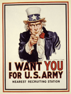
But it takes more time to pull everything apart, and out, and simplify, simplify simplify – and think long and hard about the best and most simple way to say the ONE thing we’re trying to tell people here, in a few seconds of their time, in an as impactful way as possible, leaving them in no doubt what we’re asking them to do.Like this genius example.
It almost makes me want to fight for the US. And hate them.
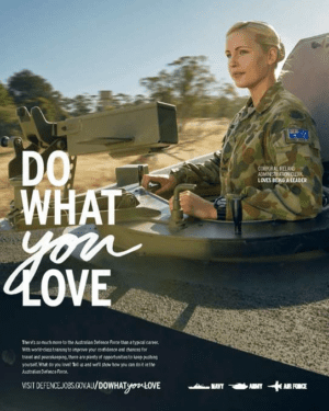
Versus the second – which doesn’t make me want to kill people like the other one.
Now go Rock it ✌
Ant Keogh
Chief Creative Officer

Firstly, Impact
Street posters have an energy about them. After all, they’re out there in the street. They’re literally down with the people. Transient and immediate. Of the moment. At best, they seem part of street culture itself.
So when we design street posters we want to go with that energy. They’re a chance to be bold, imaginative, sassy, maybe a bit rough around the edges.
I’m going to generalise here in the interest of creating some guidelines, but really, of course, there are no rules. Maybe, in this medium, the more you break them the better. I’m also going to limit this discussion to more of an advertising context where a commercial message is imparted rather than a movie or music-poster context.
Perhaps the most important aspect of street poster design – essentially visual communication meant to be read at a distance, maybe as you’re speeding past – is to create impact and communicate quickly.
How do we do that?
Well, a lot of impact comes from your idea itself but i’m going to assume you have a great idea – so let’s talk more about graphic design elements here.
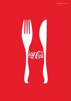
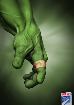
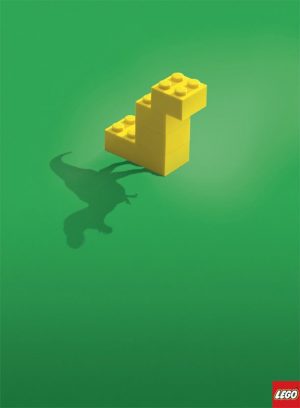
Essentially, great poster design is usually about reductionism and contrast.
You want to let something win. Is it a headline driven poster? Well, make the headline huge and the picture small (or non existent). A visual poster? Make the visual the whole poster. Any words can be small (though legible).
Minimalism is your friend here. Keep taking out elements until the poster doesn’t work anymore to find out everything you don’t need. My ideal poster would be a picture and a logo. Or maybe a picture where the logo was incorporated in the poster. Sometimes the logo can act as your headline.
Now What About Communicating Quickly?

Obviously, fewer words helps. Two or three word headlines are great. Sometimes that’s tricky and limiting and it’s worth having more but you want to keep it in check. It’s a balancing act of meaning versus simplicity.
A good rule of thumb is the headline shouldn’t repeat or double up exactly what the picture is doing. Otherwise you probably don’t need one of them. Instead, the picture should provide one half of the information and the words the other half.
You also want to be aware of a hierarchy of information, so the most important elements are the ones you see first, with subsequent design element less prominent in correlation with its importance and the order in which you want the viewer to understand it. For example sometimes you want the viewer to see the visual before the headline or the other way around. Sometimes you want the product shot or logo to be the last bit of information that provides the last puzzle piece in the story.
Of course you also want to check your poster works at a distance. Make a copy of it, stick it on a wall and stand well back to make sure it’s legible. There are all sorts of rules the creators of road signs use to make sure they achieve legibility at a distance, for example black type and symbols on yellow background are the most legible combination, followed by black type on white.
We don’t want to be this limited but it’s worth being considerate of how much contrast you have in your type and colour palette. Clashing colours like blue and red can create weird effects as can having colours with similar tonal values. Typefaces need enough weight to not get lost at a distance.

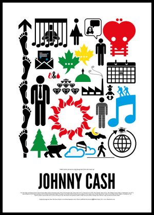
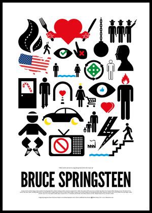
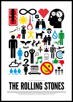
Many of the design principles I’ve spoken about are true for any poster or even print ad but the Rock Poster medium offers unique and creative opportunities. Street posters allow you to use repetition. Graphic shapes can create a great effect when they are repeated. Depending on your buy you can conceptualise your poster as a series rather than a single poster. Split your idea over two posters, for example an image on one and say a bottle shot on the other. If your design is distinctive enough they will hold together as one idea and can look great repeated.
Ben Coulson
Chief Creative Officer

How do you design a street poster?
Start by not making a fucking ad.
Street Posters are unique, they have heritage and soul. Before ads for pasta sauce started choking bridge pylons, street posters were for avant-garde bands, for rock and punk. They had edge and impact, cared little for the rules of corporate marketing, and they were brilliant. So don’t bring your brand’s guide book, think first of the medium and the audience’s expectations of it. And try to have a little soul, this isn’t a friendly medium for obvious and ugly advertising!
How do you design a poster of this size that may be consumed by one sitting on public transport, stuck in track in traffic, walking or cycling by any hour of the day?
Keep it simple, make it impactful. Choose one message you want to get across and focus only on that, don’t give in to the temptation to tell you brands life story. The design can be busy (even beautifully elaborate), but the messaging must be simple.
What makes your poster stand out from the rest?
Make it unexpected, make it intriguing. The goal should be a poster your audience want to steal, not just tolerate. Yes, there will always be a product, service, or event to sell. And yes the client will always want to see that from miles off, but this is a design medium, creativity and good design are your only chance not to suck.
Derek Van Der Hogen
Designer of the Rock Posters brand
(amongst many other things)

Have Fun!
Be concise
When designing a poster, less is more. Focus on what you want to communicate in simple terms. People only have a few seconds to absorb the information as they pass, make sure they do. Ask yourself what do I want people to do / takeaway from this and make sure that is clear.
Be bold
Bright colours, bold type and eye-catching imagery can capture people’s attention amongst the clutter. If you don’t stand out, you blend in. Make sure your design is visible from a distance.
Be inventive
Use the environment or the format to your advantage. If you can engage someone for longer by thinking outside the box they will remember you.