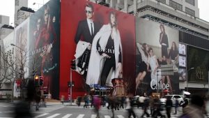
The streets are a crowded canvas. Every wall, fence and billboard competes for attention, and a street poster has only a few seconds to make its mark before someone walks past. Colour is one of the most powerful tools a designer can use to win that moment. It is often the first thing people notice, even before they read a single word.
Colour theory is more than choosing a shade that looks nice. It is about understanding how colours interact, how they affect mood and how they influence the way a message is received. In street poster design, this knowledge becomes essential. The right colour combination can pull the eye from across the road. The wrong one can make your poster disappear into the background.
This guide will break down the basics of colour theory, explain how it works in real-world outdoor environments, and explore how colour can influence both the mood of a campaign and the way people engage with it.
The Basics of Colour Theory
At its core, colour theory begins with the colour wheel. This simple diagram maps out the relationships between colours so you can see how they work together. Primary colours, red, blue and yellow, are the foundation. Mixing them creates secondary colours such as green, orange and purple. Combining primary and secondary colours leads to tertiary shades, which add variety and nuance.
Understanding relationships between these colours can help you create different visual effects. Complementary colours sit opposite each other on the wheel, like blue and orange or red and green. When placed side by side, they create a strong contrast that makes each colour appear more vivid. Analogous colours sit next to each other, such as blue, blue-green and green, and create a more harmonious, unified look. Triadic colour schemes use three colours evenly spaced around the wheel, such as red, yellow and blue, for a balanced but lively combination.
Colour theory also divides shades into warm and cool groups. Warm colours like red, orange and yellow tend to feel energetic and attention-grabbing. Cool colours such as blue, green and purple create a calmer, more relaxed atmosphere. Knowing when to use each type can set the tone for the entire poster.
Cultural associations also play a role. In Western contexts, white is often linked with simplicity or purity, while in other cultures it may carry different meanings. Understanding the audience and location helps avoid choices that might unintentionally send the wrong message.
Colour in the Wild: What Works for Street Posters
Designing for the street is different from designing for a website or a magazine. Outdoor posters have to compete with a constantly changing background of movement, light and weather conditions. This makes colour choice even more important.
High contrast is key for visibility. Text and background should be clearly distinct so the message is easy to read from a distance. A combination like black on yellow or white on red is much easier to process at a glance than pale blue on light grey. If you are using a photograph or complex background image, it can help to add a solid colour overlay behind the text to preserve contrast.
It is also important to think about how light will affect colours. A poster viewed in bright sunlight can look very different at night under streetlights. Colours with enough saturation tend to hold up better in a range of lighting conditions. Testing your design in different lighting before printing can prevent surprises when it hits the street.
Viewing distance plays a big role as well. Small gradients or subtle shifts in tone may look great up close, but will blur into a single colour from several metres away. Large, solid colour blocks often work better outdoors because they maintain their impact from far away. The same principle applies to text: keep the contrast strong and avoid colour combinations that strain the eye.
Notable Examples of Colour Done Right
Some street poster campaigns are remembered just as much for their colour choices as for the events they promoted. These examples show how deliberate use of colour can define a campaign’s success.
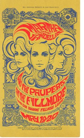
Psychedelic Concert Posters of the 1960s
Designers in the San Francisco music scene pushed colour boundaries with swirling, clashing palettes that seemed to vibrate on the wall. These posters didn’t just promote concerts; they created an immersive visual experience that mirrored the music’s energy.
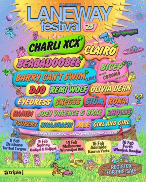
Modern Music Festival Campaigns
Contemporary events often take cues from the past. Some use bold gradients in unexpected colour pairings, like neon orange fading into electric blue, to stand out in urban environments. The contrast and saturation are designed to grab attention in seconds, much like vintage posters did in their day.
Art Exhibitions with Minimalist Colour Palettes
Some of the most striking modern posters take the opposite approach, using one dominant colour with minimal text and imagery. When executed well, this simplicity becomes a powerful statement that draws viewers in for a closer look.
Luxury Perfume and Fashion Posters
High-end fashion houses such as Dior and Chanel often use deep, rich tones like gold, burgundy and midnight blue to communicate sophistication. The deliberate restraint in colour choice helps convey exclusivity and elegance.
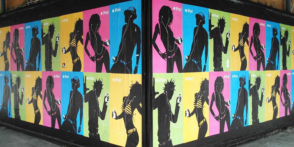
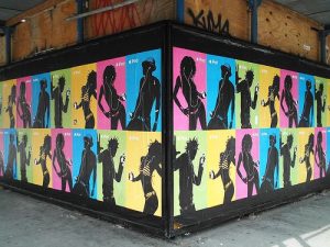
Apple iPod Silhouette Campaign (2000s)
Vivid block colours like lime green, magenta and electric blue formed the background for silhouetted figures dancing with white iPods. The minimal but striking colour scheme made the product pop from a distance.
Discuss Poster Design With Our Team
Colour is one of the most powerful tools in a street poster designer’s kit. It shapes the way people feel, helps information stand out in busy environments and can create a lasting visual memory long after the poster is gone. By understanding the basics of colour theory, adapting choices for real-world conditions and aligning colours with the mood of the campaign, designers can make their posters both beautiful and effective.
The next time you plan a street poster campaign, think about what your colours are saying before a single word is read. Are they bold enough to stop someone mid-step? Do they reflect the tone of your event? Do they work in the lighting and environment where they will be displayed? When colour and message work together, a poster has the power to do more than advertise.
If you are ready to create a street poster that turns heads for all the right reasons, our team at Rock Posters can help bring your vision to life. Get in touch today and let’s design something unforgettable.