Billboards are built to stop people in their tracks. When done well, they create immediate impact and lasting recall. When done poorly, they fade into the background faster than a traffic light turns green.
In outdoor advertising, a brilliant location or smart media buy can’t save weak creative. The design itself determines whether your message connects or disappears. According to the Outdoor Media Association, creative quality drives around 65 per cent of an out-of-home campaign’s effectiveness. That means how you design your billboard matters as much as where you place it.
Here are the most common billboard design mistakes brands make—and how to avoid them so your next campaign delivers results you can see.
1. Overloading with Text
It’s tempting to squeeze every selling point into one design. But billboards aren’t brochures. They’re short stories told at 60 kilometres an hour. The audience has seconds, not minutes, to absorb the message.
Keep your copy lean. A short headline or key phrase does far more work than a wall of text. Think in terms of one message per billboard, ideally under ten words. The cleaner the copy, the faster the comprehension.
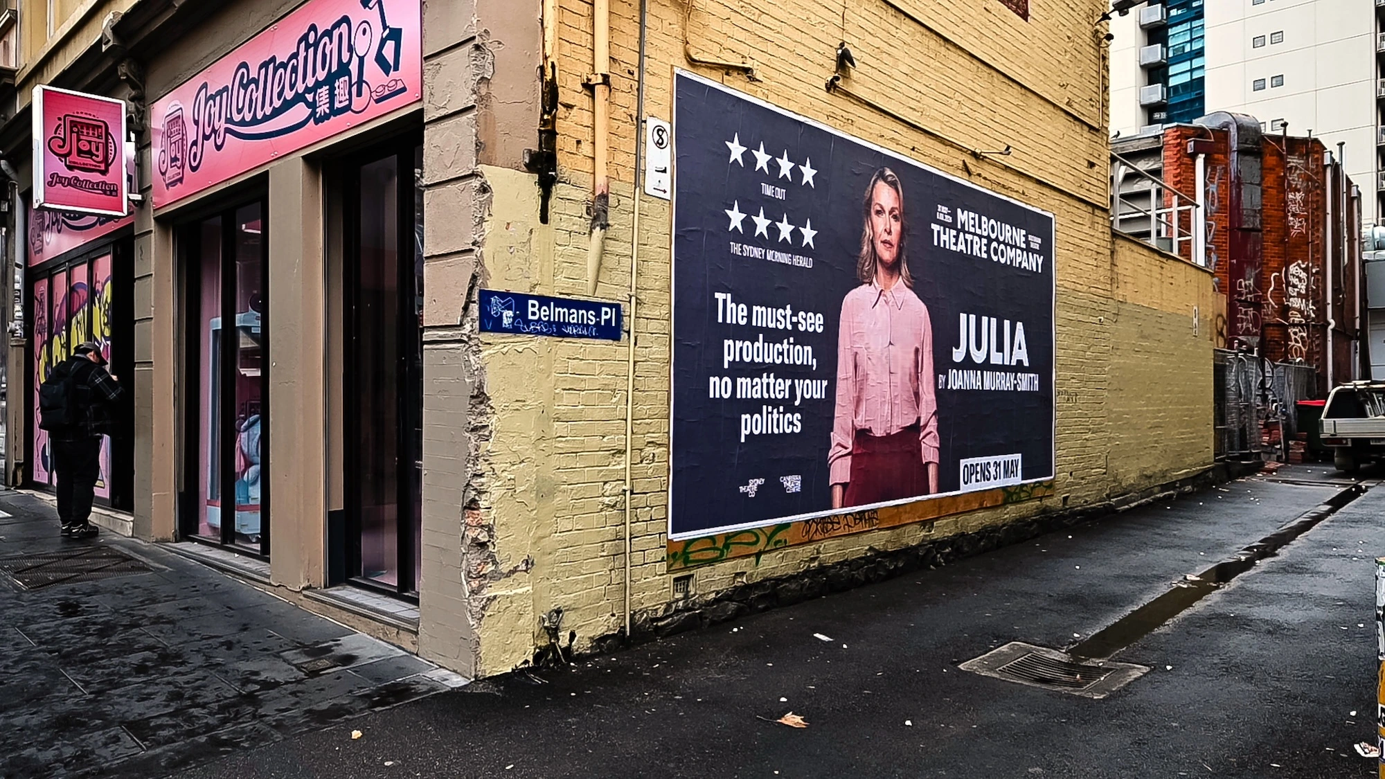
2. Weak or Complicated Imagery
Visuals are the first thing the eye catches, long before anyone reads the copy. The wrong image can dilute a message, while the right one can make it unforgettable.
Avoid photographs that are cluttered, have multiple subjects, or have low contrast. High-impact images with clear focus perform better because they translate faster from a distance.
3. Poor Font Choices
Typography can make or break readability. Fonts that look stylish on a laptop often fail miserably on a six-metre billboard. Thin, decorative, or script fonts disappear under glare or distance.
Use strong, sans-serif typefaces that hold their shape at a distance. Keep a healthy contrast between text and background colours. Avoid placing text over imagery unless it has a solid, uniform background.
A good rule of thumb: if your headline isn’t instantly legible when you view the design on your phone at arm’s length, it won’t work for drivers or pedestrians either. Readability is design’s best friend.
4. Ignoring Colour Contrast and Environment
Colour does more than decorate; it controls visibility and emotion. Too little contrast, or the wrong palette for the environment, can make even a great concept invisible.
Designers often overlook where their billboard will actually sit. A dark ad against a city skyline at dusk will disappear, while a light background will shine. In leafy suburbs, green-heavy designs can vanish into trees.
Testing mock-ups in context helps. A bright yellow background might look too bold in a studio, but it will dominate in grey urban streetscapes. Think beyond aesthetics, think environment.
5. No Clear Hierarchy
Every billboard needs a focal point. If the viewer’s eye doesn’t know where to look first, the message becomes noise. Hierarchy guides the viewer naturally through the design: headline, image, logo, and call to action, in that order.
When too many elements compete for attention, nothing stands out. Scale, spacing, and contrast create structure. A well-composed billboard uses around 40 per cent of its space for the main headline, ensuring the message lands before the car has passed.
A local cinema once split its design evenly between film title, release date, and multiple actor names. The result was visual chaos. A later version featuring just the title and one image generated far higher recall. Order creates impact.
6. Forgetting Brand Presence
Some designers go too far in the other direction, hiding the logo entirely for the sake of minimalism. While the creative might look elegant, it loses the critical link to the brand.
Your logo doesn’t have to dominate the space, but it must be visible and clear. Place it in a clean zone—bottom right or top corner—away from busy backgrounds or competing text.
A good billboard leaves no doubt about who’s speaking. It should feel confident and connected to the brand’s identity, not an afterthought tagged on at the end.
7. Overcomplicating Calls to Action
A billboard’s job is to create awareness and emotion, not deliver a paragraph of instructions. Long web addresses, multiple hashtags, or tiny QR codes all slow down comprehension.
Keep the call to action short, bold, and intuitive. If your campaign goal is ticket sales, “Book Now” or “Tickets On Sale” says it all. If it’s awareness, sometimes no call to action is needed at all—the impact itself drives interest.
Many festivals make the mistake of cluttering posters with website details and social icons. The most successful instead focus on the lineup and date, trusting that excitement will lead people to search on their own. Outdoor works best when it inspires first and informs later.
8. Designing for Digital, Not Physical
A common mistake in the age of digital marketing is treating outdoor creative like a banner ad. Effects that pop on a screen—gradients, intricate patterns, fine details—often disappear in sunlight or from a distance.
Design in real billboard dimensions rather than shrinking a digital ad to fit. Avoid relying on subtle shadows or small logos. What feels “safe” on a computer often reads as timid on a wall six metres wide.
Viewing the artwork at actual size or using an on-site simulation helps catch issues before printing. A great billboard feels bold and confident, not delicate or over-designed.
9. Ignoring Readability at Speed
Outdoor advertising has seconds to work. Whether seen from a car, a tram stop, or across a street, the design must communicate instantly.
Apply the five-second rule: if someone can’t read your headline aloud in five seconds, it’s too long. Use large fonts, strong contrast, and uncluttered composition.
Consider how the design will perform in motion. Pedestrians might have eight seconds, drivers just three. That’s why short, bold phrasing and big visual cues consistently outperform busy layouts. Clarity always wins.
10. Forgetting to Think Strategically
The final and most critical mistake is treating billboard design as an isolated exercise. Creative doesn’t live in a vacuum; it performs best when aligned with the audience, timing, and location strategy.
A visually stunning design can underperform if it’s placed in the wrong context. A winter clothing ad in summer or a premium brand in a budget suburb will struggle, no matter how well executed.
Strategic thinking turns design into results. Pairing creative expertise with placement intelligence ensures your message lands in front of the right people at the right time. Rock Posters brings both sides together—crafting designs that work in harmony with geography and audience behaviour.
Why Avoiding These Mistakes Matters
Every one of these pitfalls reduces clarity and recall. The best outdoor campaigns are built on restraint, focus, and emotional resonance. When a design gets all three right, people don’t just notice it—they remember it, talk about it, and act on it.
Outdoor advertising isn’t about decoration. It’s about communication at speed, scale, and simplicity. Avoiding common errors allows your message to cut through, no matter the medium or audience.
At Rock Posters, we’ve spent decades helping brands, festivals, and agencies create outdoor campaigns that capture attention where it matters most. From street posters to large-format billboards, we guide clients through the entire process—from concept to compliance—ensuring every design performs beautifully in the real world.
Ready to Design for the Streets?
A well-designed billboard turns a passing glance into a lasting impression. Whether you’re launching a new product, announcing an event, or building brand awareness, effective design makes the difference between being seen and being remembered.
Talk to Rock Posters about your next outdoor campaign. Our creative and strategy teams can help you design billboards that stop traffic—in the best possible way.