Published: 08/09/25 by Rock Posters
Before Instagram and digital billboards, the streets were the main stage for music promotion. Posters weren’t just announcements. They were statements of style, attitude and belonging. A single sheet of paper could tell you everything you needed to know about a band, a movement or an upcoming gig.
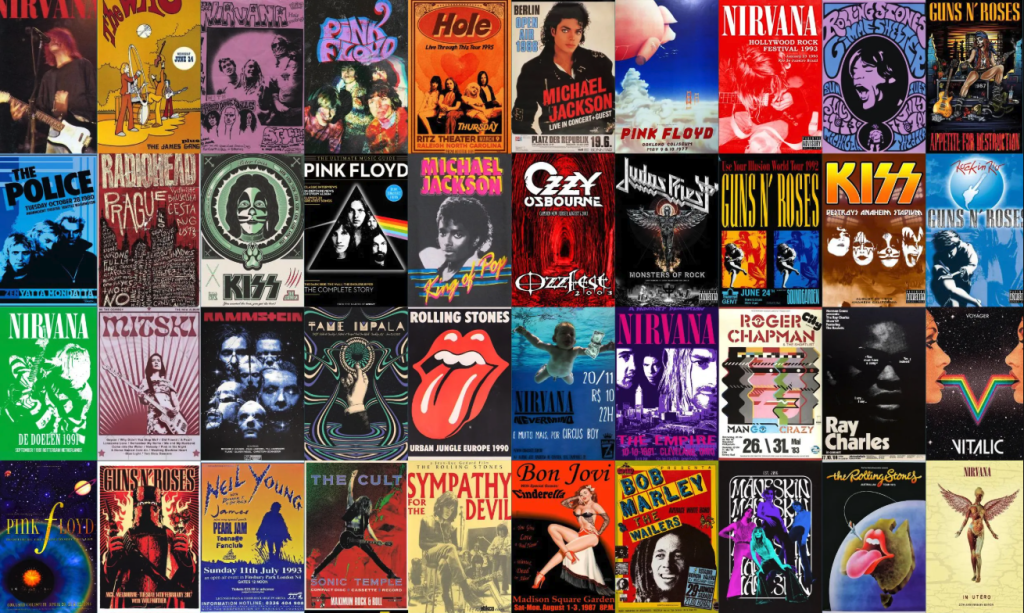
Vintage rock posters carry a charm that goes beyond nostalgia. Their bold colours, imaginative typography and often hand-drawn artistry still spark ideas for modern designers. These posters weren’t created with algorithms or marketing formulas. They were crafted to catch the eye of someone walking past a wall, to spark curiosity and to give a taste of the energy behind the music.
Understanding the roots of vintage design is more than a trip down memory lane. It can inspire campaigns that stand out in today’s crowded advertising landscape, whether you are promoting a gig, an exhibition or a festival. Let’s take a closer look at the eras that shaped rock poster art and the design elements that keep them relevant.
The Golden Eras of Rock Poster Art
The 1960s Psychedelic Movement
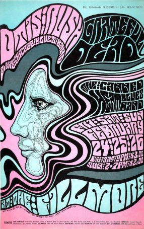
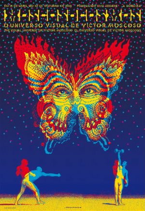
The mid-to-late 1960s saw a creative explosion in music and visual culture. In San Francisco, the counterculture movement gave rise to a style that was as experimental as the music it promoted. Designers like Wes Wilson and Victor Moscoso blurred the lines between typography and illustration. Words became shapes, swirls and patterns that almost felt alive.
Psychedelic rock posters often featured rich, clashing colours that seemed to vibrate on the page. Optical illusions and surreal imagery created a sense of movement, even in still form. These designs weren’t always easy to read at a glance, but that was part of their appeal. They invited viewers to stop, engage and decode the message, creating a stronger connection with the artwork and the event it promoted.
The 1970s Punk and DIY Ethos
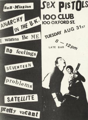
As the 1970s rolled in, the clean-cut professionalism of mainstream advertising felt out of step with the raw energy of punk. Bands and promoters embraced a do-it-yourself approach. Posters were photocopied, hand-cut and pasted together with whatever materials were on hand. Grainy images, uneven lettering and bold black-and-white contrasts became signatures of the punk scene. (Would be great to throw in a Sex Pistols poster here)
The rough edges were intentional. This was design as rebellion. The look reflected the music’s urgency and the culture’s anti-establishment stance. These posters were cheap to produce and easy to distribute, which made them perfect for underground venues and pop-up gigs. The punk aesthetic continues to influence modern designs that aim for authenticity and grit.
The 1980s and 1990s Gig Poster Renaissance
By the 1980s, screen printing brought a new level of craftsmanship to gig posters. Artists began creating limited-edition prints that were as much collectibles as they were promotional tools. The bold, graphic styles of the decade embraced sharp lines, vibrant neon colours and high-impact layouts.
In the 1990s, the alternative and indie music scenes kept the tradition alive, blending illustration with bold typographic treatments. Bands often collaborated directly with artists, resulting in one-of-a-kind designs that fans would take home as souvenirs. This era cemented the gig poster as both an art form and a marketing medium, influencing how music events are promoted today.
Australian Rock Posters
While much of the global conversation around vintage posters points to San Francisco’s psychedelic scene or London’s punk explosion, Australia built its own legacy throughout the 20th century. Our posters didn’t just echo overseas trends, they carved out a distinctly Australian style that mirrored the energy of our music and our cities.
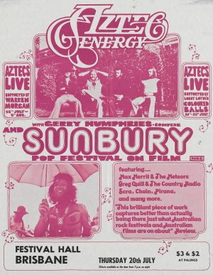
In the early 1970s, the Sunbury Rock Festival set the stage for large-scale rock promotion in Australia. As the punk and pub rock era hit in the late 1970s and early 80s, bands like Midnight Oil, Cold Chisel and The Angels filled the streets with hard-hitting posters. The designs reflected the urgency of the music: stripped back, high-contrast graphics, urgent fonts, and imagery that spoke directly to the working-class audiences packing venues night after night.
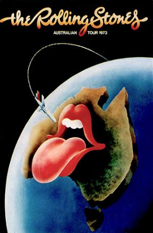
Designers such as Ian McCausland and John Foy became household names in poster art. McCausland, who worked with Mushroom Records and created artwork for festivals like Sunbury and tours for acts including the Rolling Stones, was known for his bold compositions and use of vibrant colour. Foy, working under Skull Printworks in Sydney, developed a punk-inspired aesthetic that shaped the look of independent music promotion for decades.
Key Design Elements That Still Work Today
Typography That Commands Attention
From the swirling letters of the 60s to the blocky, cut-out styles of punk, typography has always been at the heart of rock poster design. Vintage styles show that fonts can carry personality as strongly as images do. In modern campaigns, the challenge is to keep the impact while ensuring the message is clear from a distance.
Choosing a typeface that suits the event’s character, while balancing readability, is key.
Colour That Demands a Second Look
Vintage rock posters rarely played it safe with colour. The psychedelic era thrived on bold contrasts, while punk designs often stripped things back to stark black and white. Screen-printed gig posters of the 80s and 90s used bright, saturated tones that jumped off the wall. Today, colour choices can set the mood before a single word is read. A well-chosen palette can make a poster instantly recognisable and memorable.
Lessons for Modern Campaigns
Vintage rock posters show that good design isn’t just about looking attractive. It is about creating a reaction. Whether that reaction is curiosity, excitement or nostalgia, the design has to stop people in their tracks.
One lesson from the past is the power of storytelling through visuals. The best vintage posters gave audiences more than just the date and venue. They gave a glimpse into the energy of the performance, the values of the artist and the tone of the event. Modern campaigns can take this approach by using visuals to convey mood and identity, not just information.
Another takeaway is the value of texture and authenticity. The imperfections in hand-drawn illustrations or screen prints make them feel more personal. In an age where digital design can feel overly polished, adding subtle texture or tactile finishes can give a poster a unique edge.
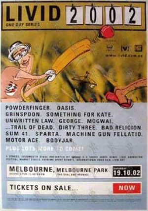
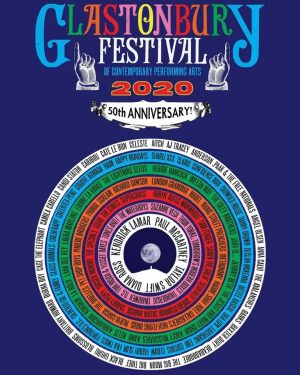
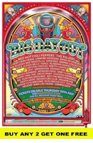
Lastly, vintage design reminds us to consider the street as the audience’s first touchpoint. A poster must be clear and legible from a distance, but also rewarding up close with details that draw the viewer in. Balancing these two levels of engagement is a skill that applies to both traditional and modern campaigns. (This is a great section I reckon we could do a whole thing on the Big Day Out posters, the Livid posters, Coachella, Glastonbury, etc, people would love that!)
Modern music festivals, such as Big Day Out, Livid, Coachella, and Glastonbury, have evolved the tradition of street poster campaigns. These contemporary designs go beyond simple promotion, incorporating diverse artistic styles while maintaining strong brand consistency.
Notable Vintage Street Poster Campaigns
Some vintage street posters have become cultural artefacts, remembered as much as the events they promoted. These designs didn’t just sell tickets – they became symbols of an era.
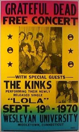
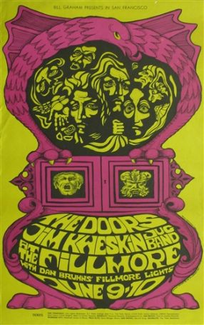
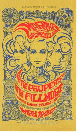
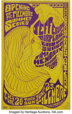
The Fillmore Concert Series (1960s)
Promoter Bill Graham commissioned a series of psychedelic posters for shows at the Fillmore Auditorium in San Francisco. Artists like Wes Wilson and Bonnie MacLean created works with vibrant colours, experimental lettering and surreal imagery. These posters are still studied and collected today for their groundbreaking style.
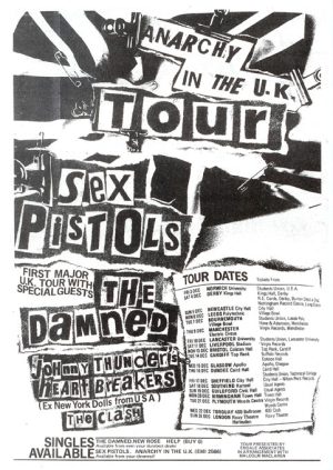
The Sex Pistols Anarchy Tour (1976)
Raw, cut-and-paste punk graphics and provocative imagery perfectly matched the band’s chaotic energy. The posters looked like they had been thrown together in a hurry, yet every element communicated rebellion and urgency.
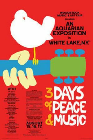
Woodstock Music & Art Fair (1969)
The iconic dove-and-guitar design by Arnold Skolnick is instantly recognisable. It balanced a peaceful, minimalist image with bold text, capturing the festival’s spirit of unity and music.
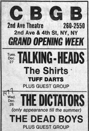
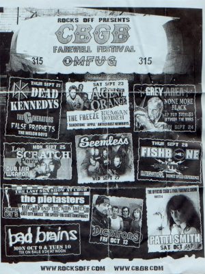
CBGB Gig Posters (Late 1970s–2000s)
The New York club’s flyers and posters were a visual record of the punk and new wave scenes. With their black-and-white photocopy look, they carried the underground authenticity that became a design staple for decades.
Design an Unforgettable Street Poster Campaign
Vintage rock poster design is more than a style choice. It is a reminder of a time when the streets were a gallery, and every wall had the potential to spark excitement. The bold typography, striking colours and fearless creativity of these designs still hold lessons for modern campaigns.
Whether you want to recreate the swirling psychedelia of the 60s, the gritty urgency of punk, or the vibrant graphics of 80s gig culture, vintage inspiration can give your posters a depth and personality that stands apart.
If you are ready to create a campaign that captures attention and stays in people’s minds long after the event, our team can help you bring that vision to life. Get in touch today to start your next street poster project.